In May 2011 I accepted an offer to join the Digital Marketing team at TIM Brasil. Before this, I was managing a travel retail store (Duty Free Dufry) that even not having much in common business wise, has promoted my skills managing digital products. By the time, a recent end to end eCommerce update in Dufry's website catch attention of TIM as they were planning a whole new website to the beginning of 2012. This is how my career starts here.
Launched in 2012, TIM's new website had 3 main goals: Promote voice and Internet plans, selfcare customer service due to reduce costs in calls and sell devices linked to post paid plans. I was responsible for creating the digital guideline for TIM Brasil, guaranteeing the same look and feel across all pages and sub domains. After signing off all main design elements I was also in charge of proofing wireframes and interactions, information archtecture, validating all 32 templates and prototypes in several circunstances and browsers, focusing in performance issues (e.g. downloading time) and SEO, mapping the quality assurance scenarios and be sure everything would be good to go by the time established.
This new website was considerated 100% done in December 2012, containing 900 friendly URLs. By the time I left the company (2015), the number of visitors have come from 3MM to 13MM due to an intense ongoing SEO work.
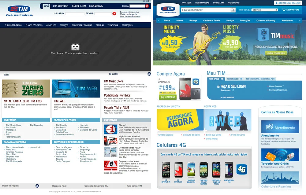
2011 version showing the main banner in Flash and 2012 version
In the next 3 years I assumed a project manager role being responsible for releasing monthly updates in all company's websites and apps. I was responsible for managing documentation, design, testing and releases by SCRUM rounds. During this time we made a massive SEO development in the CMS allowing friendly URL edit, meta tags, title tags, head tags, breadcrumb and image optimisation.
Other rounds of developments were also justified by surveys, blind tests, presential tests and MVT.
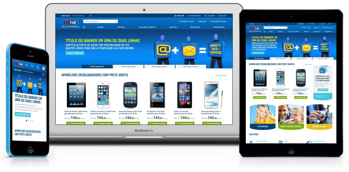
2015 version
MVT (Multivariate Testing)
It was an amazing addition for us and an essential tool (optimizely) to improve our business. Features like heatmap, mouse flow and traffic filter has given to us an impressive and detailed understand of our visitors behavior. Main goals back in time were conversion rate at LojaTIM (eCommerce) and services acquisition at MyTIM.
MeuTIM -MyTIM
Launched at the same time as the institutional website, MyTIM was created to promote a wide range of services available to both B2B and B2C clients. It was complex to produce a structure flexible enough to provide a good experience for 20 different kinds of client, which have a very specific needs each, mixed with other standard services.
In 2015, MyTIM website reached 3.2MM visits/month, three times more than in the previous year. This website helped the company save over £3 millions YoY. My responsibilities were just as described previously as this website is one of the sub-domains mentioned before.
MyTIM login and dashboard screen. Several tests to understand essential needs and decrease bounce rate. Tutorial videos and FAQs were a big help once placed in the correct step and position during the login flow
MyTIM - App
In order to support a huge increase in mobile access to MyTIM, we have launched in the second semester of 2013 the first selfcare application. At this time, our target was to cover the 10 most used services. I was responsible for adapting the services flow from web to mobile, do wireframes and approve the layouts. I was also in charge of managing the quality tests in Android and iOS, considering most used operational service version, screen size and type of client. By the beginning of 2015 the app reached 5MM users.
2013 first version - Purely functional. This "not so gorgeous" first shot gave us the understanding we need to come up with the next version below
MyTIM in 2015
Coverage Map and alternative contact channel - App
Due to be transparent about it's products, TIM released in 2013 this application showing company's coverage 2G/3G/4G, WiFi spots and Antennas. In addition, it is possible to report failures and get feedback in a few clicks. This is of course helped to save money form calls to customer service. Geolocation by GPS allows clients to easy quick search their area and also send pre defined or customised complaints. (It is integrated to Google maps API)
I was responsible for adapt the idea and concept of TIM transparency campaign/policy and organise information architecture, proof the UX, map the quality assurance scenarios, test and deploy. By Q1 2015 the app got 65K installations.
2013 version above compared to 2015 below
Devices guide - Troubleshooting platform
This website was , again, another initiative to reduce costs from calls to the contact centre. We figured by analysing the logs and interaction in MyTIM, that most issues could have been solved efficiently in a interactive way, by images and some animation. This kind of calls used to cost TIM an average cost of £1. At that point we were supporting 38 different devices.
I was responsible for finding the partner, decide the portfolio and manage the development following the digital guidelines mentioned before (make all digital products design consistent). Also all the standard steps before releasing: write the tests, execute, manage bug fixes and deploy.


